E-commerce
Nike Footwear
E-commerce Product Website
nike-footwear.app
Step 01: 1. Overview
A footwear-focused commerce presentation with strong product imagery, promotional sections, and conversion-oriented calls to action.
An image-led footwear showcase exploring product hierarchy, promotion, and responsive storefront composition.
Area Details Project Independent product-showcase concept Contribution Frontend implementation, interface composition, and interaction design Status Frontend portfolio project Nike Footwear is an independent footwear-commerce UI concept. The project brings product imagery, promotional sections, and calls to action together in a storefront-style presentation.
My focus was the front-end product experience: how a visitor’s attention moves from the brand presentation to the merchandise and then to the action associated with it.
Step 02: Features
- Product-centric landing experience
- Strong hero and promotion messaging
- Responsive showcase sections
- Commerce-ready CTA placement
- Visual emphasis on featured footwear
- Clean catalog presentation patterns
Step 03: 2. The problem
A product page can become visually impressive while leaving the merchandise difficult to compare or understand. Promotions, imagery, and navigation all compete for space.
The challenge was to use strong visuals without losing a clear product hierarchy or making the page depend on a single desktop layout.
Step 04: 3. Users and responsibilities
User Responsibility Primary user Understand the available information and complete the page’s main task Site owner Present a coherent product or professional identity Step 05: 4. Product workflow
- Explore product presentation.
- Scan featured merchandise.
- Review promotion.
- Follow a product action.
The flow above describes the product journey. The following sections explain the implementation and the boundaries of this case study.
Step 06: 5. Core capabilities
Capability How it appears in the product Product imagery Footwear-focused visual presentation Promotion Dedicated promotional sections Calls to action Product-oriented next steps Responsive layout Consistent styling across viewing sizes Step 07: 6. Implementation and architecture
React components and Tailwind styling provide the UI foundation. Repeatable product and promotional elements help keep spacing, typography, and action placement consistent.
This case study concerns product presentation. It does not claim affiliation with Nike or the implementation of a production checkout, payment service, or fulfillment backend.
Technology stack
Layer Technology Interface React Styling Tailwind CSS Language JavaScript Web foundations HTML and CSS Step 08: 7. Engineering and product decisions
Decision Reason Product-first hierarchy Keep the footwear central to the experience Promotional sections Give campaign content its own place Consistent action styling Make interactive elements recognizable Responsive composition Allow the design to reflow rather than simply shrink Step 09: 8. Trade-offs and current scope
This is an interface-focused portfolio project. Its value is in layout, information hierarchy, reusable components, and interaction design. Production integrations, database guarantees, security controls, and business results should only be added to the case study when they are established by the implementation.
A useful next validation pass would check narrow screens, keyboard navigation, long or missing content, and the feedback around interactive controls. These are proposed checks rather than a claim that a new automated test suite was run during this content revision.
Step 10: 9. What I learned
Storefront polish comes from the relationship between the product, supporting information, and action. Decorative impact should strengthen that relationship.
Step 11: Project links
Keep exploring
View all projects Related projects
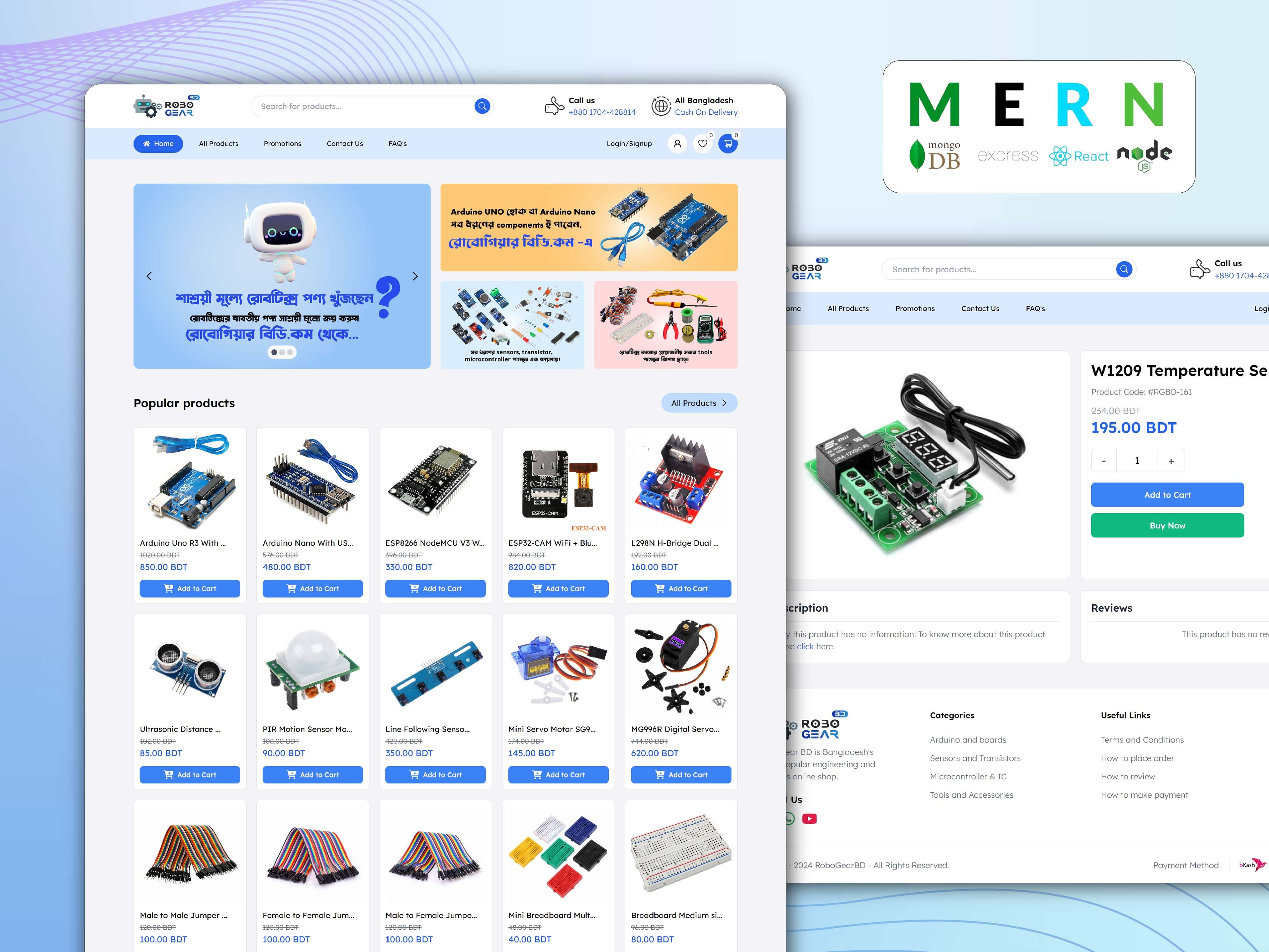
Full Stack · E-commerce
Robogear BD
Online Robotics Shop
HTML · CSS · JavaScript · Tailwind
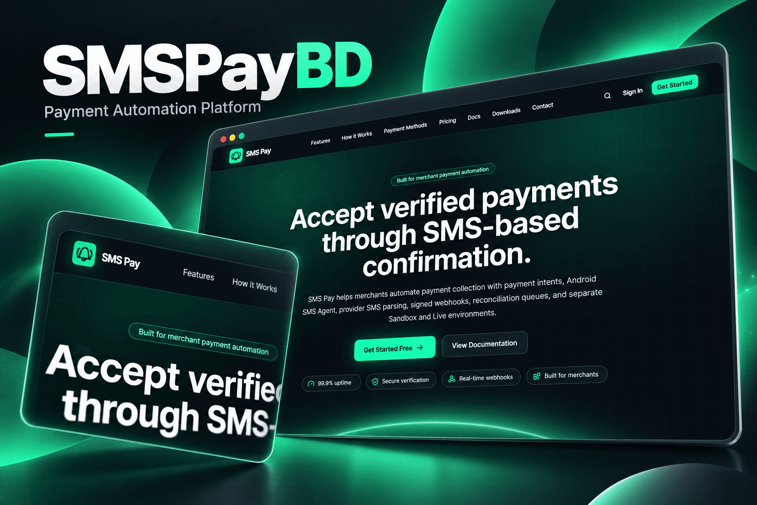
Full Stack · Fintech
SMSPayBD
Multi-tenant SMS Payment Reconciliation Platform
Next.js · NestJS · TypeScript · PostgreSQL
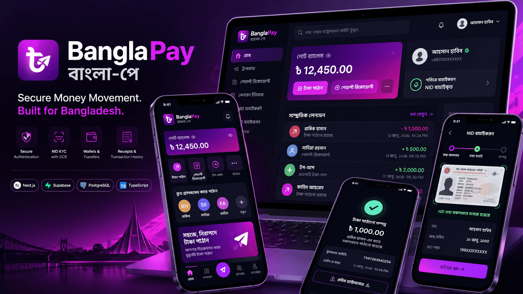
Full Stack · Fintech
BanglaPay
A secure MFS simulation built with an auditable double-entry ledger
Next.js 16 · React 19 · TypeScript · Tailwind CSS v4
 Newsletter
Stay in the Loop
Occasional emails about new projects, blog posts, and what I'm building - no spam.